
We have been spending time talking about alternatives to PPT in “The Scoop on Alternatives to PowerPoint” series including:
• PowToon
• Emaze
and we’ve made suggestions for How to Make Your Presentations Remarkable no matter which platform you use. We’ve been taking the time to give you these new ideas for presentations because the truth is that the better your presentations are the more successful your events will be, for your business and your brand.
In this article about Infogr.am we’ll take a look at a tool for making an interactive infographic. An infographic is (according to Wikipedia):
…a graphic visual representation of information, data or knowledge intended to present complex information quickly and clearly.
Presenting complex information in a way that is fast and easy for someone to understand is always a good idea. But like all the PPT alternative tools we’re putting forth in this series it’s important to know what your presentation objective is and how to avoid bad presentation pitfalls so many people seem to fall into.
For an infographic, just as with any presentation software, there are a lot of common mistakes people seem to repeat. So before you get started creating an interactive infographic with Infogr.am, here are 5 common mistakes to be aware of so you can avoid them:
Mistake 1. Talking about your products and services
Like any other presentation if all you do is present lists of what your company does and offers then you’ll be labeled as a salesman and people just don’t listen
Mistake 2. Not being original
Don’t make the mistake of looking at an infographic you love and then copying it only to swap out the numbers. However, it’s perfectly fine to study numerous infographics you like and then draw inspiration from them.
Mistake 3. Putting in too much information
Just because you’re creating an “infographic” does not mean it’s okay to put in as much information as you can possibly cram in.
Mistake 4. Being insignificant
We’re all too busy to waste time – especially at conferences and events. So provide valuable information that has some depth and increases the useful knowledge of your audience.
Mistake 5. Using poor graphics
This part is key. Since you are creating a visual representation of information your infographic needs to be eye-catching with graphics that pop and are meaningful.
That’s where a tool like infogr.am can be helpful – it can help you stay on the right track when you are not a designer. So let’s go ahead and give this software a try.
Infogr.am Plans (Free, Pro, and White Label)
For this article we’re sampling only the “Free” version, which of course, means what we can do is somewhat limited. The Pro version is $18 per month and the White Label is $50 per month when there is no special pricing.
What you can’t do on the free version:
• get rid of all the infogr.am branding
• save or download your infographic (which means on the free all you can do is public publication)
• use real time data
• access all the design themes
• add your custom logo
• remove the infogr.am share buttons
Mashable.com touts Infogram as useful for great visuals with minimal learning curve.
Infogr.am Basics
Now that you know what you can’t do with the free version let’s see what you can do. The startup dashboard is as simple as it gets with only 3 buttons to choose from:

When you’re first starting (assuming you don’t want to immediately upgrade to pro) you’re going to click on “create” because there will be nothing in your library yet.
From there you are going to select which template you want to begin with. Once the template opens you’ll double click on any of the dummy text or images to put in your own information.
They do a good job of making it easy to add elements, either from the vertical menu:

The icons are, in order, 1) add a chart, 2) add a map, 3) add text, 4) add a picture, 5) add media. You can scroll over any of the icons to see what they are. This same menu will come up horizontally if you scroll between any elements on your infographic and it will go exactly where your curser is.
Just click on “add a chart” to pull up the chart menu. You’ll get everything from word clouds to stat charts – and in many different formats. This means you should find the best graph for the information or data you are presenting – each one will have slightly different options (don’t stress, you can always go back and change).
Once you’ve added what you want you scroll over the top for the pencil edit icon to show and then you click on that. This will pull up the data pages for your chart and you manually change it to your own data or use the “load data” link at the top. It is very intuitive on how to edit these charts, even if you are not overly tech savvy.
For our simple infographic example we chose to highlight some of our technology resources to help you create lucrative events in 2015. Naturally if you were going to do an infographic for a presentation you’d spend more time – for comparison our total time on this interactive infographic was about 20 minutes.
The Interactive Part of your Infographic
To see how the “interactive” part works, take a look at the “Tech Equipment Rentals” section on our graphic below. You’ll see that there are two areas “Technology Rentals” and “Entertainment Industry Rentals”. When you click on either bubble it pulls up that information.
Though you can’t download your infographic, you can embed it as we’ve done here. The code to do that will come up on the screen after you click “publish”. Here is the screen you get when you click publish:
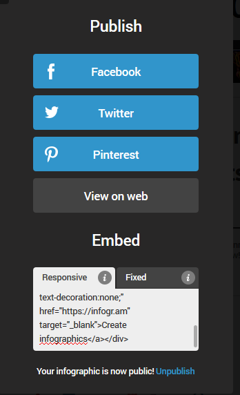
As you can see they make it simple to publish on social media or get the responsive or fixed embed code.
Infogr.am is so easy to use we recommend you get in there and click around a bit to see what you come up with.
What was not intuitive:
• editing content was easy we could not easily find a way to edit the formatting of the text
If you really like the idea of creating interactive infographics for online or offline presentations this year, you can get some useful information from The Infogram Blog.
Resources
1. https://blog.kissmetrics.com/infographic-warning-signs/